
 Two studies done from still-life objects in photoshop. I've been thinking lately about ways to improve my skills, and what better way than to go back to basics? So here's some relatively simple shapes.
Like any other artist, gestures are an important exercise I keep up with. It's a great way to warm-up and get your mind into the right mode of thought, and it helps you hone your ability to not make your drawings suck or be as stiff as board planks.Even though doing gestures of everyday events and people (parades, malls, etc.) are a vital thing, for warm-up purposes it doesn't quite work out. There's not many options, to be frank, that can let you replicate the timed sessions a class or life drawing session gives you, beyond using a stopwatch and some self-control.That is, of course, until I found out about irfanview. I knew about it for sometime, but I didn't know it had a pretty damn extensive slideshow feature. This, coupled with the terrific photos from Character Designs, makes for an great way to get into a warm-up routine (To me, at least, it beats posemaniacs out of the water.)So to tie this all into some new art to post, here are some gesture sketches I did using this set-up, as well as a little dragon sketch I did the other day (if for no other fact than "How to Train Your Dragon" is still fresh in my mind.)


 Some doodles out of the old sketchbook of a sea monster...the face was a blend of these two fish I saw on Discovery Channel's "Life" last Sunday...
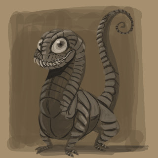
Geez, at the rate I'm posting here I'm in the running for longest time between updates...Well then! Time for some art! Chris and I last week were at Megacon last weekend (what with it being not more than 30 minutes away from me,) and we had a great deal of fun! It's not as artist friendly as some other conventions (Read: Heroes con,) but like any other one it always ends up being entertaining in one way or another. We had issue 01 of Border Crossings printed and on sale there, and we were able to sell quite a few copies (enough to cover parking, at any rate, so yay!)There's gonna be some brand-spanking new art up here soon, and to kick it off, here's a warm-up doodle I did one evening before sitting down to ink. It's some sort of lizard fellow, near as I can tell.
Well! It's been a looong time since my last post. This year, the holidays were extremely busy for me, and this has been about the first time in a long while where I felt like I can at least take a minute to breath and catch some of you wandering readers up to date. I think I can be safe to promise that I don't intend to have this long of a lapse again for a long, long while.Border Crossings, for those of you who don't read it regularly, has kicked into Issue 02 last fall, and has been steadily updating. Not every page has been a winner in my eyes, but overall I think it's shaping up to be a stronger issue than the last one. Here's one of a few sketches I did of Venetia as prep work for the second issue. There's about a two week gap in the timeline between the events of the first issue and the second, so I felt that by that point Venetia would have tried to get herself into comfier clothing. She still retains part of her wetsuit, but you can also see that she's started to adopt the Island's culture. By the time I started drawing her in the comic, she acquired some sort of dreadlock hairstyle, capped with metal bits.
 Here's some other random sketches as well, of various things that had just popped into my head over time.
 As Chris and I move to update the site and churn out issue 02, we still made plans to make sure our weekly content update continued. This little illustration of an Annelid is one of such updates that we've done when I was unable to update a page (between issues, or previously, when I was moving. Never for anything else!)
I wanted to talk about this piece because it's an example of happy accidents. Originally, it had a lightsource from above illuminating the creature. It was alright, but it felt like the drawing wasn't working to the best of abilities. So I took it out of Painter, moved it into Photoshop, and began playing with some layer modes. After some weird result of difference and/or exclusion, the light source became inversed, giving the drawing a much needed boost.
If you're ever stuck on a piece, (especially a digital one,) sometimes all you need is to change something dramatically on it, whether it be the color scheme, the lighting, etc. Often, happy accidents emerge which push you past the block, and gets you moving again.
 Today, I sit down and begin thumbnailing the pages for Issue 02 of Border Crossings. This isn't the first itme I read through the script though. I received it a few weeks ago from Chris, and gave it a quick read to get an idea of the story and what I might have to draw. Without spoiling much, there's a lot of great stuff in it, and I think this issue will be much better than our first one (which I'm still proud of.) I've taken a lot of guesswork out of my process over the course of the first issue, so I expect things to go smoothly this time around.
When you read through a script, whether it be for comic books, or in preparation for storyboards, the more times you read through it, the better off you'll be. The biggest benefit you can have is it'll cut down on continuity errors throughout the story. I like to spend about a day reading and re-reading through the script, taking breaks occasionally to read the news or other articles online, look up some reference depending on what the script may call, and of course, draw. I'll start thumbnailing about halfway through the day, and revise it one or two times before I start doing my roughs.
The next couple of posts will be Border Crossings-centric, with some sketches and other goodies from the next issue. Stay tuned!
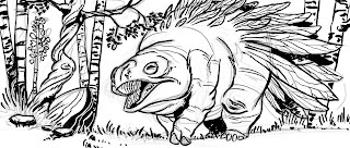
 Here's an update on the Toadbat, now with color! Right now, the color scheme is being glazed over the grey values. You'll notice that it muddies the colors a bit, but that's fine, as right now this is just to get a general idea of color and lighting. Stay tuned!
 Also, here's a little warm-up I did this morning. I was reading through the illustrated edition of "The Wonderful Wizard of Oz" (by David Chauvel and Enrique Fernandez) and I forgot how incredible Fernandez's work is in it. So this is a sort of practice in that thick paint style of his. Not nearly as nice, but it's always good to do stuff you wouldn't normally tackle...
 This is the full image from the last post, with tonal values splashed on there. It's still a work in progress, but at the moment I'm working up a solid value relationship before I start to tackle color. This was a tip I learned from watching one of J.P. Targete's videos from The Gnomon Workshop (quite possibly one of the most helpful videos I've ever seen from them.)The actual idea for this came about from listening to one of Bobby Chiu's video streams. Somebody suggested he draw "a toad crossed with a bat," and when he decided not to take it, I thought it'd be a waste to let a weird idea like that slip away. So that's how this came about!
 It's...well...what the heck is it? It's a peek at a little illustration I'm doing...a shiny ha'penny to the one who can guess what it might be.
 Here's some late night screw-arounds in the painting department...
 Here's a teaser for this coming Friday's NEW page of Border Crossings. For anyone that had been following, there was a two week break as I made the move from Atlanta BACK down to Central Florida. But now we're settled in and work has returned to a steady pace.I'm really happy with how the inks on this page turned out, and you'll get to see not only a confident, inked page, BUT a new attempt at coloring, one that's taking a cue from the lessons learned from Mark Sweeney's blog about ink limits. His little corner of the web is more than helpful: It's a damn goldmine that's free to the public. Ya can't find this stuff in books!
Mark Sweeney's Blog: Link
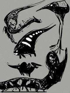
 Here's some creature doodles that were done as warm-ups recently. Sometimes it's fun to just take a big, fat brush and see where it takes you on the page...Especially when you know you aren't trying to achieve anything beyond letting your mind wander. Done in Alias Sketchbook.
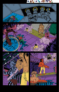
 Above is from the latest page of Border Crossings, which, if you follow the webcomic at all, you will get to see come Friday, when it's updated. It depicts our first view of The Last Island, where all the land-dwelling races have converged upon (either by choice or by force) as the landmasses have sunk below the ocean. If you notice, the Rhizome is sporting a funky pattern on its camo-sheath, something that was spur of the moment and that I really enjoyed compared to my previous solution for depicting the swirling, psychedelic colors of the sheath.
I wanted to talk about this panel for two reasons. One, because I'm actually quite happy with it as a separate little piece of work, and two, the inking on this is FAR different than what I've done since my process post about inking a few weeks back.
Ever since I did page 9, I've grown unhappy with using rapidographs as my inking solution. I never felt totally happy with it, and often I noticed I moved veeeeerrrryyy slowly when inking. So, since then I started an experiment of inking digitally. Remember the Frog Grazer illustration a few posts back? The reason for that piece existing is because I was testing out a new brush that was to become my standard inking tool for BC. I figured if it was a bust, no one would be the wiser, and if it worked out, hey hey, I have a new thing to practice.
I've noticed lately that I've been inking faster now, mostly because of a boost of confidence (probably because I always know that that ink I'm throwing down isn't permanent.) At some point in the future I'd like to switch over to traditional brush, but while I continue to practice with a real brush, scrawling mishapen characters with the permanence of Higgins Ink, I'll keep going along with this digital solution.
...Life's just been busy! I've been gearing up for a move out of the current apartment that's taking place in about a week, so between that, keeping stuff going for Border Crossings, searching for more freelance stuff to take on to earn a little more income, and some personal projects, I've been quite neglectful of all my haunts on the internet. In the meantime though, I thought I'd throw out two things for everyone to see, one as a preview and one as an in-progress shot. This first one is a color rough done awhile back for an illustration piece I've yet to have time to tackle. As with all things I've been doing lately, it's an exercise in learning new things, and I'm actually quite tempted to do this up completely traditionally. I actually really like the composition and colors for this, and think when it's completed it'll look pretty good as an illo.
 Remember this? With whatever free time I've had as of late, I've been working on this bit by bit. I had started to record the process, but quickly after finishing the grayscale stage it seemed to go by the wayside (mostly because running the software AND painter was making everything slow.) In anycase, I'm at a crossroads with this piece -- while I like the idea of it, I'm not sure if the composition (and, by extension, the POV choice) is as savvy as it can be. I think this little bit has been nipping at me the whole time through the piece, since I've restarted it from scratch a few times now, this being the fourth iteration. So I ask the folk of the internet of their opinion, whether it be a suggestion to improve it, a Yea or Nay to trash it and start anew, or otherwise.Keep tight folks, I'll see if I can squeeze another post in before the move.
 I've been playing around with making brushes in photoshop look and act a bit more like real brushes for inking purposes. I made one that I think worked pretty well, so I did a small illustration to try it out.
 Later on, I decided to color it, just to bring it all the way to completion. I'm not really sure what this critter's deal is, but he's got a colorful butt.
The next, and near final stage of making a comic page is coloring. If you do a quick search on the internet, you'll find TONS of information and ideas on how to go about it. Like most everything else in life, there's not really a wrong way to go about it. The method I use I actually learned from the DC Guide to Computer Coloring and Lettering, written by Mark Chiarello and Todd Klein. If your linework was done in ink, I'd advise to follow this method, as it seems to work pretty well.
Most tutorials I've seen out on the web tell you to take your linework, duplicate it onto another layer, then set it to multiply. This lets you color underneath the linework without disturbing any of your hard work. That's all well and good, and it has its uses, but for me, I actually prefer to use channels to separate my lineart. I work in CMYK mode for all my comic pages, since I always assume that at some point or another these pages may be in print (this is something that if you ARE actively doing a webcomic or something else you intend to publish that you should take into account.) Working in CMYK let's me do a couple of things: I can separate my lineart onto a whole different channel away from the artwork, check my colors to see if there's too much (if any) black (otherwise known as K) in them, and it cuts down on my layer use (at most, I end up using 4 or 5. Most of the time it's around 2-3.)
 So, the first step in all of this is to separate shapes in the lineart in a process known as "flatting." At this time, I'm not worrying about the correct colors. I have two goals here:1) Cover all the white of the page2) Make sure all my colors are distinct enough from each other that I can select them with the magic wand later without any problems.Whenever I do any color fill-ins, I always use the Pencil tool. Why? Because it's aliased, just like my lineart. Why in the heck would I work mostly aliased? Because it actually helps in keeping stuff fairly sharp when you scale down. If it was all done aliased, it can have the potential to become blurrier than you imagined.
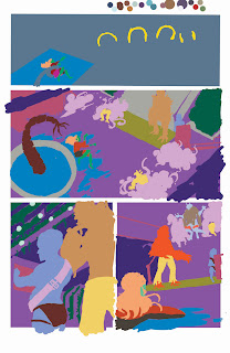 This is what the page looks like if I were to close the document and open it back up. Notice there's no white between the colors? This ties into a later step, called "trapping."
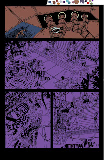 Now comes the time where I start to lay in the actual colors that will appear when the comic gets put on the web. I lock the layer that had my selection colors (all those ugly colors we saw earlier,) and start a new layer on top of it. Then, I usually use the rectangle selection tool and throw in large expanses of color to set the main colors of each scene. The top panel's color was blue, while as you can see, the bottom panels were a purple color for the Rhizome's airlock chamber. I'm still using the pencil tool.
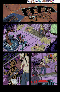 Here are all the base colors laid in with the pencil tool. You might notice on the top panel there's some fancy textures going on. Any sort of extra detailing that isn't just blocks of color, I'll do with a brush, since the brush will handle that sort of thing A LOT better than the pencil tool ever could. In some areas you can see I colored while thinking about shadows, but most of that work is saved for the next step.
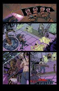 I create two new layers, one for shadows, and one for any sort of lighting effects (like the top panel.) The shadows are mostly handled with either the Multiply or Darken mode on, but the lighting effects can vary, depending on what's needed. The top panel's light effects were mostly done with the brush in Color Dodge mode, to get that super bright effect.I should note, during all this, and especially towards the end, you should have color theory in mind. If your light is a cool green-blue, then you can expect your shadows to actually be something like a warm red-violet. There are a ton of places to learn about this sort of thing, and it's really a subject that goes beyond just this one post.Anyway, back to the matter at hand: I have all my coloring done, and I flatten the image. Remember when I mentioned earlier about "trapping?" Well, I need to make sure my lineart has a deep-rich black, and there will definitely be NO WHITE between the lines. So, I copy my lineart (that was on a separate channel, remember?) back onto the main page with a color of 60C/40M/40Y/100K.Why that mix? Because straight 100 percent black isn't really black, it looks more like a dark muddy grey. That mix above actually gives a deep, rich black.Once the lineart is copied, I delete the extra channel, and save it. Now we take it into Illustrator, letter it, then save it as JPEG to the web! Then come Friday, you have a new page of Border Crossings!Okay, now a few end-class notes: I really recommend picking up the DC Guide to Computer Coloring and Lettering. The other DC books are alright (I feel there's probably better material elsewhere,) but the Coloring guide is a BIBLE. All these steps I glossed over are covered in pretty good detail here, and it's definitely worth your money to have it with you if you do this regularly.Now then, here are a few links that talk more about coloring and lettering:Mark Sweeney's Blog: I actually found this about a half a week ago, but it answers a lot of questions like, "Why shouldn't I use black in my colors," or "Is RGB and CMYK really different?" Consider it supplemental reading to your DC guide.Balloon Tales: This site goes into MUCH greater depth on lettering than I ever could. Worth a read to learn how to do lettering properly and why(something that most people who self-publish don't really take the time or care to learn.) Seriously, you want to look amateur? Don't read this site, and use Comic Sans or (god forbid) Arial for your lettering. You want your work to actually look professional, READ THIS SITE.


 Chris and I last week were at Megacon last weekend (what with it being not more than 30 minutes away from me,) and we had a great deal of fun! It's not as artist friendly as some other conventions (Read: Heroes con,) but like any other one it always ends up being entertaining in one way or another. We had issue 01 of Border Crossings printed and on sale there, and we were able to sell quite a few copies (enough to cover parking, at any rate, so yay!)


 Today, I sit down and begin thumbnailing the pages for Issue 02 of Border Crossings. This isn't the first itme I read through the script though. I received it a few weeks ago from Chris, and gave it a quick read to get an idea of the story and what I might have to draw. Without spoiling much, there's a lot of great stuff in it, and I think this issue will be much better than our first one (which I'm still proud of.) I've taken a lot of guesswork out of my process over the course of the first issue, so I expect things to go smoothly this time around.


 In other news, Border Crossings is towards the end of its first issue! Tomorrow will be page 21, then after that will be the last page of issue 01. Chris and I are planning to take a two-week break between issues, but it won't mean we're resting. Instead, we'll be redesigning the site to make it more friendly for first-time readers, while doing a marketing blitz for the webcomic. I'll be taking the time to also work on building up a buffer for issue 02, so I'll have a little more free time for other projects.


 This is the full image from the last post, with tonal values splashed on there. It's still a work in progress, but at the moment I'm working up a solid value relationship before I start to tackle color. This was a tip I learned from watching one of J.P. Targete's videos from The Gnomon Workshop (quite possibly one of the most helpful videos I've ever seen from them.)


 This first one is a color rough done awhile back for an illustration piece I've yet to have time to tackle. As with all things I've been doing lately, it's an exercise in learning new things, and I'm actually quite tempted to do this up completely traditionally. I actually really like the composition and colors for this, and think when it's completed it'll look pretty good as an illo.
 Remember this? With whatever free time I've had as of late, I've been working on this bit by bit. I had started to record the process, but quickly after finishing the grayscale stage it seemed to go by the wayside (mostly because running the software AND painter was making everything slow.) In anycase, I'm at a crossroads with this piece -- while I like the idea of it, I'm not sure if the composition (and, by extension, the POV choice) is as savvy as it can be. I think this little bit has been nipping at me the whole time through the piece, since I've restarted it from scratch a few times now, this being the fourth iteration. So I ask the folk of the internet of their opinion, whether it be a suggestion to improve it, a Yea or Nay to trash it and start anew, or otherwise.


 This is what the page looks like if I were to close the document and open it back up. Notice there's no white between the colors? This ties into a later step, called "trapping."
 Now comes the time where I start to lay in the actual colors that will appear when the comic gets put on the web. I lock the layer that had my selection colors (all those ugly colors we saw earlier,) and start a new layer on top of it. Then, I usually use the rectangle selection tool and throw in large expanses of color to set the main colors of each scene. The top panel's color was blue, while as you can see, the bottom panels were a purple color for the Rhizome's airlock chamber. I'm still using the pencil tool.
 Here are all the base colors laid in with the pencil tool. You might notice on the top panel there's some fancy textures going on. Any sort of extra detailing that isn't just blocks of color, I'll do with a brush, since the brush will handle that sort of thing A LOT better than the pencil tool ever could. In some areas you can see I colored while thinking about shadows, but most of that work is saved for the next step.
 I create two new layers, one for shadows, and one for any sort of lighting effects (like the top panel.) The shadows are mostly handled with either the Multiply or Darken mode on, but the lighting effects can vary, depending on what's needed. The top panel's light effects were mostly done with the brush in Color Dodge mode, to get that super bright effect.
