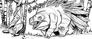
 I've been playing around with making brushes in photoshop look and act a bit more like real brushes for inking purposes. I made one that I think worked pretty well, so I did a small illustration to try it out.
 Later on, I decided to color it, just to bring it all the way to completion. I'm not really sure what this critter's deal is, but he's got a colorful butt.
The next, and near final stage of making a comic page is coloring. If you do a quick search on the internet, you'll find TONS of information and ideas on how to go about it. Like most everything else in life, there's not really a wrong way to go about it. The method I use I actually learned from the DC Guide to Computer Coloring and Lettering, written by Mark Chiarello and Todd Klein. If your linework was done in ink, I'd advise to follow this method, as it seems to work pretty well.
Most tutorials I've seen out on the web tell you to take your linework, duplicate it onto another layer, then set it to multiply. This lets you color underneath the linework without disturbing any of your hard work. That's all well and good, and it has its uses, but for me, I actually prefer to use channels to separate my lineart. I work in CMYK mode for all my comic pages, since I always assume that at some point or another these pages may be in print (this is something that if you ARE actively doing a webcomic or something else you intend to publish that you should take into account.) Working in CMYK let's me do a couple of things: I can separate my lineart onto a whole different channel away from the artwork, check my colors to see if there's too much (if any) black (otherwise known as K) in them, and it cuts down on my layer use (at most, I end up using 4 or 5. Most of the time it's around 2-3.)
 So, the first step in all of this is to separate shapes in the lineart in a process known as "flatting." At this time, I'm not worrying about the correct colors. I have two goals here:1) Cover all the white of the page2) Make sure all my colors are distinct enough from each other that I can select them with the magic wand later without any problems.Whenever I do any color fill-ins, I always use the Pencil tool. Why? Because it's aliased, just like my lineart. Why in the heck would I work mostly aliased? Because it actually helps in keeping stuff fairly sharp when you scale down. If it was all done aliased, it can have the potential to become blurrier than you imagined.
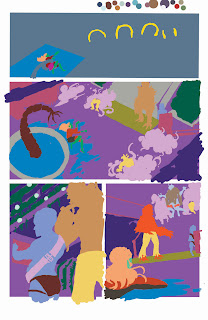 This is what the page looks like if I were to close the document and open it back up. Notice there's no white between the colors? This ties into a later step, called "trapping."
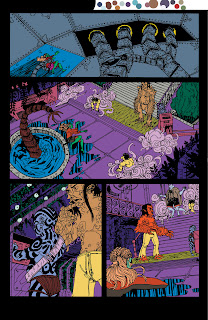
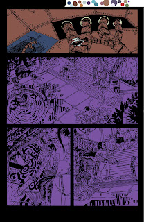 Now comes the time where I start to lay in the actual colors that will appear when the comic gets put on the web. I lock the layer that had my selection colors (all those ugly colors we saw earlier,) and start a new layer on top of it. Then, I usually use the rectangle selection tool and throw in large expanses of color to set the main colors of each scene. The top panel's color was blue, while as you can see, the bottom panels were a purple color for the Rhizome's airlock chamber. I'm still using the pencil tool.
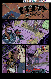 Here are all the base colors laid in with the pencil tool. You might notice on the top panel there's some fancy textures going on. Any sort of extra detailing that isn't just blocks of color, I'll do with a brush, since the brush will handle that sort of thing A LOT better than the pencil tool ever could. In some areas you can see I colored while thinking about shadows, but most of that work is saved for the next step.
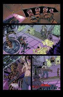 I create two new layers, one for shadows, and one for any sort of lighting effects (like the top panel.) The shadows are mostly handled with either the Multiply or Darken mode on, but the lighting effects can vary, depending on what's needed. The top panel's light effects were mostly done with the brush in Color Dodge mode, to get that super bright effect.I should note, during all this, and especially towards the end, you should have color theory in mind. If your light is a cool green-blue, then you can expect your shadows to actually be something like a warm red-violet. There are a ton of places to learn about this sort of thing, and it's really a subject that goes beyond just this one post.Anyway, back to the matter at hand: I have all my coloring done, and I flatten the image. Remember when I mentioned earlier about "trapping?" Well, I need to make sure my lineart has a deep-rich black, and there will definitely be NO WHITE between the lines. So, I copy my lineart (that was on a separate channel, remember?) back onto the main page with a color of 60C/40M/40Y/100K.Why that mix? Because straight 100 percent black isn't really black, it looks more like a dark muddy grey. That mix above actually gives a deep, rich black.Once the lineart is copied, I delete the extra channel, and save it. Now we take it into Illustrator, letter it, then save it as JPEG to the web! Then come Friday, you have a new page of Border Crossings!Okay, now a few end-class notes: I really recommend picking up the DC Guide to Computer Coloring and Lettering. The other DC books are alright (I feel there's probably better material elsewhere,) but the Coloring guide is a BIBLE. All these steps I glossed over are covered in pretty good detail here, and it's definitely worth your money to have it with you if you do this regularly.Now then, here are a few links that talk more about coloring and lettering:Mark Sweeney's Blog: I actually found this about a half a week ago, but it answers a lot of questions like, "Why shouldn't I use black in my colors," or "Is RGB and CMYK really different?" Consider it supplemental reading to your DC guide.Balloon Tales: This site goes into MUCH greater depth on lettering than I ever could. Worth a read to learn how to do lettering properly and why(something that most people who self-publish don't really take the time or care to learn.) Seriously, you want to look amateur? Don't read this site, and use Comic Sans or (god forbid) Arial for your lettering. You want your work to actually look professional, READ THIS SITE.
 A'right, now that the pencils have been scanned, we move onto inking! I wouldn't be honest if I didn't give this disclaimer before I get into this post: Out of all the phases in my comic-making process, this is the one that is still fluctuating and changing wildly. Inking isn't my strong suite, and my method is NOT the best, or even one of the better methods out there. Now then...
I'm a little hesitant to ink over my original pencils. I have too much pressure attached to the whole thing, so to take that away I actually print out my pencils onto a separate page. If anything goes wrong, hey, no big deal, right? Just print out another, or even better, smatter the page with some white touchup and I'll be good to go.
 Most of my lines are done with a Rapidograph Koh-I-Noor technical pen. I used Microns and other disposable tech pens in the past, but I don't care for them. The ink fades, and they never last long enough if you're inking more than 2-3 pages, 4 at best. I was fortunate though, that my family had a full set of Rapidographs just sitting at home for years, well before I actually went to use them (my Mom, who is the ever vigilant coupon-saver and sales watcher, probably grabbed them from Michaels at a liquidation sale or something else that had them immensely cheap.) I actually use Higgin's Drawing Ink (I think it's called Black Magic?) in my tech pens, something that has some advantages and disadvantages.Pros:-It's a thin enough ink that it flows through the pen without gunking it up too much-You're able to buy the HUGE bottles of it and keep your pens topped off for months, if not years.-It's a decent ink that you know what's in it.Cons:-It probably does cause more maintenance for a pen that already requires quite a bit of maintenance. I think these things have become a little more finicky since using Higgins in them, and I've noticed times where they'll vomit ink in their caps or all over the tip.-Unless you have an eyedropper or even better, a pipette, it can become a REAL hassle to fill them.
-
It doesn't nearly have the same line variance as a nib pen, or even better, a brush.-It's a decent ink. It's not the best ink I've had (I actually prefer Bombay Ink,) so you have to take into account all the qualities that comes with a decent quality ink. That third Con is a big thing This is another thing I wanted to mention about tech pens, that could either be a pro or con depending on how you look at it: All the pens are fixed width. Microns at least actually have some flexibility to them, albeit very small amount of flex. The way Rapidographs are designed, they can't take advantage of a felt nib for that flex. It's cold, unbending metal. The plus side is that you're inking a lot of technical things, say buildings, machinery, or vehicles, you have an unyielding line that can offer a smooth, mechanical look to them. The downside? If you ink anything else with them, you get a smooth, mechanical look that's hard to shake. Not only that, but if you want to really take advantage of inking theory such as line weights, you need to buy several of these pens. I think now is the time I should mention one of these fellas runs about $25. Yep. Just one.
 To fill blacks, I've ditched using a regular brush to using a Niji waterbrush filled with Higgins ink, something that I learned from James Gurney (though he uses it for far better endeavours.) It saves time going to and from the well, and if you don't have a crappy enough brush for black fill-in or you can't fit your wide brush into the ink well, these'll do nicely, and cost about as much as a cheap brush. They have nylon fibers for the bristles instead of felt, so you'll actually be able to do some brush effects with them (go on, try it!) I ought to note that I haven't gotten a rich, even black from them yet, it comes out more as a really dark grey. It might be the paper I'm using to ink, which is some leftover Blueline paper (something that doesn't seem to suck up ink well at all.) So once I run through that and switch over to decent paper, this may not be the case anymore.
Anyway, at this stage there's two big goals: Determining my spot blacks to make compositional elements work better, and to refine my linework once again and add all the necessary details.
There are not many people in the world of comics that I think can pull off good artwork without spot blacks (Cheeks immediately springs to mind as being one of the top guys who can do such a thing.) I can tell you right now, good spot blacks on a page can make a page. A good rule of thumb that one of my professors use to tell us was "It needs to look good as lineart. If it doesn't look good as lineart, or even worse, it reproduces terribly, you're artwork isn't doing its job." If you shy away from spot blacks, I urge you to reconsider. They don't have to be used as shadows, and infact, you shouldn't think of them that way. I should probably give another post solely on this.
Anyway, as I said before, this stage in my process is right now always in flux. What I do on one page may not be what I'll do for another, and the page after that might be different too. In fact, I'm actually trying out digitally inking my next page of pencils in photoshop to see if I can get a more sensitive line quality. I've picked up the brush again after nearly a good year and a half of neglecting practice, and I'm starting to do that again. I hope one day to actually be able to ink most of my stuff with a brush. I've also been looking at nib pens again after a few helpful suggestions from old friends and professionals. Maybe someday once I'm a little more experienced and not as wet behind the ears I'll be able to do a more proper post on all this.
In the meantime, stay tuned for the next process post. Once the inks are all dry, we take it back yet again into the computer, and begin the coloring/lettering process! I should also mention that come this Friday, you'll be able to see the finished page in all its glory on the webcomic Border Crossings, which can be found riiiiiight over here.

 Since it's been awhile since artwork has actually been on this blog, here's two things that have already made the rounds in other parts of the Internet. One was a creature study/paint exercise, while the other is some linework for an illustration I'm working on. Enjoy!
 Above are the pencils for page 09 of Border Crossings. There's not much to say, but I'll see what I can muster:
A few of the pages I did for Border Crossings were actually penciled digitally -- if you can figure out which ones they are, then I didn't do my job well enough. This page is actually the second iteration. The first version of it was done all on my Cintiq a while back, and while it was alright, there were underlying storytelling issues, which got compounded by my tightening of the pencils (which showed my frustration with the storytelling A LOT.)
I should mention that at this stage, I actually have a pretty good idea of what the page will look like, and not much is actually drawn on the fly. By the time I'm done with layouts and getting to this stage, the page is complete in my mind, it's just a matter of getting it onto the paper.
There were a few problems to solve though during it. A few of the things were realizing that I hadn't designed the tattoos yet for the Pnaiki and some background item designs. For the Pnaiki, I did a quick sketch to get the general tatoos down, while for the background items, I went through my morgue file to find some exposed engines and other objects with big, huge pistons, gears, etc.
My setup for drawing is probably pretty average: I have a drafting table (though I've been thinking of getting a new one - I'd like a table I can stand and draw at,) a good light source, an eraser, pencils, and of course, rulers and other drafting tools. It was drawn with a col-erase blue pencil, which I rather enjoy for penciling because it's a good mix of hard/soft lead and I can get a good line out of it. I imagine there's an equivalent for a regular graphite pencil, I just never looked hard enough.From here, I take the pencils, scan them into Photoshop, then I move onto the inks phase!
The next process post will be up tomorrow (could very easily have been up a few days ago, but life gets in the way...)
Chuck asked me about how I go about doing my perspective work digitally, I thought I'd take some screenshots of Photoshop to explain exactly what I do, since just words will probably make it far more confusing. I'm also thinking of doing a future post that shows some analog perspective tricks, for the folk that sit more at the drawing table than the computer desk.
Anyway, let the screenshots flow forth! You'll probably need to click on them to view some details in a larger screen.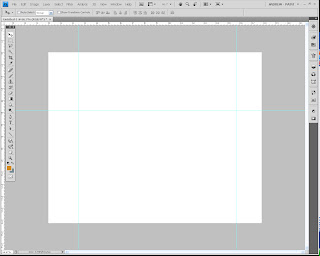 In your new document in Photoshop, enable Rulers (by going to View, show> Rulers.) From there, drag out some guides, you'll need at least three if you're doing two-point perspective (one to represent your horizon line, one to set as an anchor for your right vanishing point, one to set as your left.)
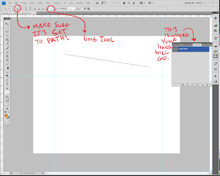 Once you have your guides laid out, click on View, and then select "Snap." Make sure the option for Snap to Guide is on, as this is how you'll make sure all your lines converge on the same point. For the sake of simplicity, I'd also make sure snap to grid is off.Select the shape tool (I think it might also be called the polygon tool as well...) and change it to Line. Now, here's an important step, which I've highlighted in the screenshot: Make sure the option is set to Paths, and not shape. This prevents it from actually showing up on the canvas until you're actually ready (I should note that this version is CS4, so earlier versions might have this placed elsewhere. Refer to your help manual to see how your layout is set up, though if you're on CS3 it's probably the same.) Also note where you see the line show up: It's under a tab called Paths, which is usually grouped with the Layers and Channels tabs. Most likely, your line right now labeled as "Work Path."
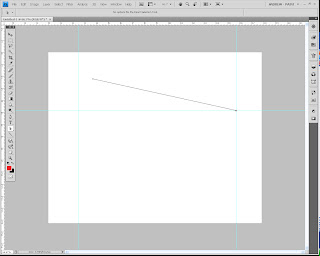 When I laid down the line earlier, I thought I had Snap turned on, but it turned out I didn't. So in this step, I selected the end point (I'll explain later how to do this) and dragged it to the right anchor point. It should snap into place where the two guide lines meet. Congrats! Your first perspective line is made.
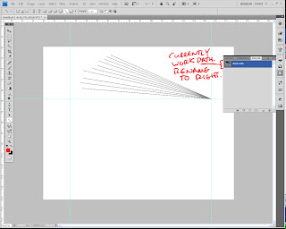 At this point, repeat the previous two (one if you had snap on and made it go to the anchor point first time through) steps to make as many more perspective lines as you want for the right vansishing point. Don't worry about making correct perspective, what we're doing is making a quick template that you can alter and change later. What you want right now is a bunch of lines that converge on the right anchor point. I'd try and make sure the other ends don't snap to any other guide points.Once you've got a healthy amount (you can always add more later), double-click the name "work path", as if you were renaming a Layer. Incidentally, the name window pops up! This is how you save your path. If you left it as Work Path, next time you boot up PS, it'll disappear. Poof. Gone. Plus, we can't have the left and right VPs in one path selection (we could, but it gets messy.) So rename this one "Right VP" or "Right" or whatever else that will remind you that it's the right vanishing point.
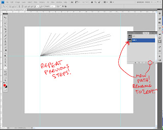 Now that you've gone and finished up the right vanishing point, it's time to do the left one. See the little button on the bottom, same place as where the button for "new Layer" is one the Layers tab? Click it, it creates a new path. Rename the path to be "Left V.P" or "Left." From there, repeat the steps you did to create the perspective lines for the Right V.P., but this time anchor them to the left point.
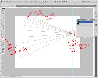 Okay, you've got both your V.P.'s lined and you're ready to make perspective. Using the Direct Selection tool (refer to the screenshot,) select end points to drag them around. I should note that even if you're selecting one line, you should do a Click-Drag method, since simply clicking on a point and moving it can create...problems. So just trust me on this. Pull out the lines to where you want them to be. This is also when you set up your V.P. in its correct position. Just click-drag to select all the end points on the V.P., then start dragging it around (you can take the time now to also adjust the guide if the Horizon line is too high up for you, or too low, etc.)For the sake of this demo, I'm being really arbitrary about it, but of course in your own piece this is where you actually use all that knowledge you have of perspective to have CORRECT placement. I should also point out you can pull these lines well off the live area of the document, and they still show up, so you can gauge how far away you really need that V.P. Go ahead, try it, I'll wait.
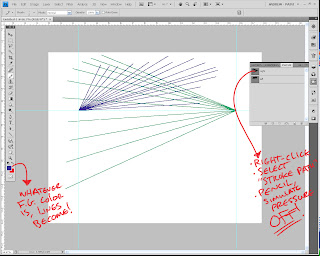 Finished? Good, because we're going to actually draw the perspective lines now. You see, the joy of Paths is that you can alter and change it before you actually decide to commit it to the page. Once you're ready though, here's what you do:-Select for your foreground color the color you want to use for your perspective lines. I like to have each V.P. have a different color, but whatever doesn't confuse you, go for it.-Select your pencil tool, and notch the size down to anywhere between 2-4 (you'll probably have to play with this, more in a bit.)-create a new layer for your perspective-Select the V.P. path you want to commit to the document.-Right-click it, then select "stroke Path." Set it to Pencil, with "simulate pressure" OFF.Voila! Your lines are now drawn on the page for one of your V.P.'s! Repeat these steps for the remaining ones, and your perspective grid is good to go for your drawing.Regarding the Pencil Tool: you might have to do a few Ctrl+z's before you actually find the right size that works for the piece you're working on. Paths have a tendency to stroke a bit larger than what the tool actually does. So that brush size 4 may actually look like a 6 or an 8, just to give you an idea. Play around with it a bit.I should also tell you that this works best for pieces that don't involve a Dutch Angle (titled view.) Anything that alters the horizon line from being a straight horizontal obviously can't use guides as the horizon line, but it is possible to still use this method (just some creative thinking will have to take place.)Hope this helps out some folks, and of course, if you have any questions, feel free to ask away.
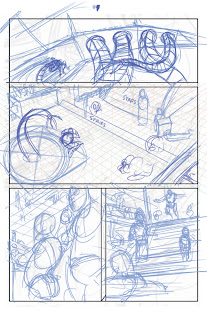 Above is the layout pencils for page 9 of Border Crossings. I thought I'd make this into a whole start-to-finish series of posts, so hopefully somebody gleans something from all this.
My process back in college was pretty varied, and fluctuated as often as the tide does. Early on, I used to do thumbnails, followed by roughs (on 6 X 9), followed by blown up roughs that I would tighten (11 X 17 at this point!), followed by lightboxing the whole page to clean it up.
I hated it, to say the least.
It took too long, and involved too much running around (popping out to Kinko's to make copies is never a good step to have...it just seems to slow down everything.) Once I got to drawing the actual page, I hated the page, and felt like I had drawn the damn thing several times over (which I did, more or less.)
So I switched it up in my Junior year. Two big things changed in my process that I kept with for a while: I penciled entirely in blueline (used to do tight blueline, then clean it up even further with a dark graphite pencil,) and I dropped doing the 6 X 9 roughs.
I was happy with it, it gave my work some much needed life in it, and kept the whole process fun for me, which was important.
There was a drawback though, which was the fact that lacking those roughs meant that I jumped straight from 2 inch high thumbnails to 11 X 17 comic board. Yikes.
Needless to say, I often erased and redrew stuff a lot. And I had some occasional problems with perspective.
Anyway, moving on. When I first started penciling Border Crossings, I kept it entirely digital, which was great! It brought back the rough pass on my pencils, which meant I could refine stuff without getting too detailed on everything. I blew up my thumbnails in photoshop, then started to refine right on top of them. My compositions were in place, I had rough perspective lines in (so I could lay down perspective that was right according to my original camera angle,) and all that other good stuff.
Unfortunately, after doing a few pages entirely digitally, it was tough. The pen felt really slippery against the tablet surface, so I didn't feel like I had too much control, which meant there were times of "Eh, it looks alright. It's not great, but it might work."
So, here we are. To be honest, this is the first time I'm doing this new step, but it worked out fine, and I think it's a good blend of all the pros of the old techniques:
I took the thumbnail of page 9 and scaled it up to 11 x 17 (remember how the thumbnails were already accurately proportioned? This is why.) From there, I ruled out the panel borders, and loosely defined the staging a bit better. If you notice in the second panel (it might be really hard to see, I think the opacity was turned down a bit too low,) there's some perspective lines gridded in there. These were done using the paths tab and the line tool to make sets of perspective lines for the left, right, and top/bottom VP. This allows me to accurately get perspective lines in there quick and painless, and to start to lay in some basic environment ideas. I actually have a digital template saved that has all these lines ready to be used, so I don't have to spend time recreating them for each page. I just select the right workpath, and set it in place.
You might notice the bottom right panel is different from the thumbs. This is another great part about the layout stage, I can change around some stuff and still keep it loose, and see if it'll work. In this case, the original idea in the thumbnail didn't seem to stage the reveal too well, so I altered it to bring us down near Venetia's viewpoint.
I should note this whole stage is done digitally. The point of it isn't to refine, but define some areas that were a little iffy in the thumbnails, and get things locked down that I know will be vital, like perspective lines.
From here, I flatten the whole image, and to make it easier to pencil over, switch it to grayscale mode, then to duotone mode. In Duotone mode, I set it to monochromatic, then give it 25% cyan only. This gives it a really light blue color that I can still see, but when I pencil, won't show up much in the finished pencils.
From there, I sit down at the drawing table and get started on actually drawing...
 Above, are thumbnails for upcoming pages for Border Crossings, which you can find right here. If you can make out my little scratchings, some of the pages up there (most notably 9, 10, and 13) have an alternate or two, in the event I didn't think a panel was working as well as it could have been.This is actually a pretty recent trend for me in thumbnailing for my comic pages. Before, I would often scribble directly on the script, often right beside the panel description or near it. It was great because I could immediately map out what I had in mind, or I could try a few different variations and then notate which one I wanted to use later. Eventually, I'd reference them for them I start laying in my pencils, or I would scan them in, and stitch them together into a frankenstein Photoshop file, then pencil above that.Unfortunately (at least for me, as all artists have different quirks to them,) it wasn't ideal. I often ran into the problem of having panels that didn't mesh together well enough, or were a lot more out of proportion with the comic page than I actually thought. What was once a great composition for the panel would have to be readjusted, or completely rethought if it turned out not to work as well.So I made up a little thumbnail contact sheet in Illustrator, something even the simplest of graphic program users can do. From there, I still will occasionally scribble an idea directly on the script, but now I thumbnail directly into the little boxes (which, if you notice, are proportionate to a 10 x 15 live area of comic board, which is what I most frequently use.) Everything's in proportion, it's a small enough space to prevent too much noodling (though you might notice I couldn't help myself here and there,) and it lets you see a set of pages all at once to see if they work together or not (an incredibly important notion regarding any sort of sequential pages.)


