

The sketches, doodles, and artwork of Andrew Sides.
Showing posts with label Inks. Show all posts
Showing posts with label Inks. Show all posts
Wednesday, April 15, 2015
Stog the Pitkeeper
Here's the latest finished Orc portrait...Stog the Pitkeeper. This time around I really utilized a tiling technique to put in swatches of color and value to build it up, I think it came out really successful.

Monday, March 23, 2015


Monday, January 26, 2015
Orc Portraits
Here's some recent personal stuff I've been doing as part of an idea of a digital book I'm kicking around. A series of portraits of Orcs, which is really an excuse for me to draw some appealing but ugly guys and work on my handling and understanding of light and color. I originally toyed with the idea of doing it all digitally from start to finish, but having actual ink work in the piece REALLY makes it sing, so that's the method I'm taking for these.
Finished piece, and color study for the next portrait.


Finished piece, and color study for the next portrait.
Sunday, January 11, 2015
Back to the grindstone
As it's become painfully aware each year, holidays are terrible for me when it comes to productivity and keeping up with stuff. So like clockwork, at the start of a fresh new year I need to play a bit of catchup and get back into the swing of things. So let's start!
I just came back from a trip to London and Paris for the holiday with family, and it was a blast. Prior to the trip I picked up Graphic L.A., so throughout my time there I was trying to incorporate some of those thought processes in the book into my landscape sketching while we walked about. There's some successes here and there, and some flubs, but I like the exercise and I'll probably continue it.
Done with ballpoint, pentel brush pen, and markers (kept to one value at first, then opened up to a light and dark value.)


I just came back from a trip to London and Paris for the holiday with family, and it was a blast. Prior to the trip I picked up Graphic L.A., so throughout my time there I was trying to incorporate some of those thought processes in the book into my landscape sketching while we walked about. There's some successes here and there, and some flubs, but I like the exercise and I'll probably continue it.
Done with ballpoint, pentel brush pen, and markers (kept to one value at first, then opened up to a light and dark value.)
Wednesday, July 25, 2012
Transformation Walkthrough

This was a piece I finished this past weekend, and I've had a few people ask me about some process stuff about it. So I thought this would be a good time to put down all my thoughts on paper and show how I went about it. It's nothing fancy, but maybe someone will get something out of it.

Often when I'm trying to think of new
ideas, I'll write something down or doodle out a small bit of it and
let it stew in my brain for as long as needed. It's not a perfect
system, since I tend to lose some ideas that I think were quite good,
but what it does allow is time for my mind to turn it over and over,
strengthening the concept and vision of the art.
Fortunately for this one, the idea
leapt out readily while I was driving home one evening. Usually my
initial thumbnail to cement it doesn't reflect what I eventually
finish out, but in this case it stayed pretty true throughout,
besides a few proportion adjustments here and there.
The thumbnail itself was about 2"
high and done in my sketchbook with just a mechanical pencil (I use a
very fat mechanical pencil to prevent hand strain, and a .09 mm lead
because I like the chunkiness of the line now and then.) Scanned it
in at 400 dpi, then upped the size to around 8 inches high or so and
brought it down to 200 DPI.
At this point I lower the opacity of
the the scanned image and create a new layer on top of it. This is
when I actually start to try and make sense of the scribbling I did
in my sketchbook and turn it into a proper drawing. I'm using a
basic brush, opacity and size set to pen pressure, and a dark grey
(not black) color is used. Nothing fancy, yet.

My main goals during this is to establish forms and figure out some of the dicier things, like anatomy, perspective, overlapping forms and whatnot. I really try and restrain myself from detail at this point, since I'll be inking it later and I'd rather not retread the same ground, but I do sometimes go back and add some here and there just to solidify some ideas in my head on what things should look like. I'm also using reference photos at this point, namely ones of me looking upwards to get the undershot of the nose right, my hand gripping a dowel rod, and armor reference from one of the many books I have.
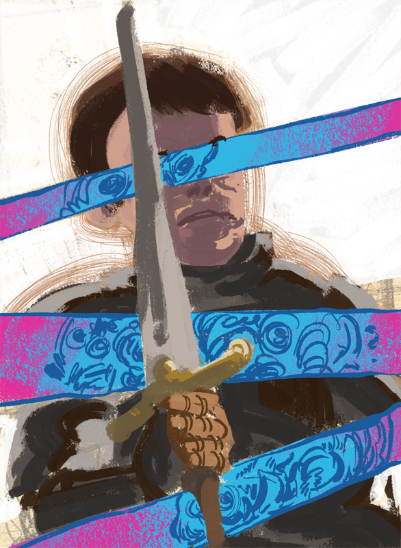
I also at this time did a color rough,
just to work out the ideas I had for the scheme in my head. I wanted
the transformation to be pretty psychedelic, while the rest of it was
grounded in more real colors, with a backlight. Stark white
background to make it pop.
Right, so the pencil drawing is done.
Turn it into a monochromatic light red color so when it prints out
it's like I used a col-erase to draw it all. I have a piece of 13x17
bristol board that I print the pencils out on at 12x16. It seems
whenever I thumbnail I automatically do something pretty close to
comic page dimensions (some habits die hard.)
Step away from the computer and move
over to drafting desk. I ink primarily with a Winsor & Newton
Series 7 sable round, size 2. Back when I started to learn how to
ink I used a much smaller size, and honestly I think that kept me
away from a long while. If I just stopped complaining and buckled
down on the 2 I probably would have come back to inking with a brush
much, MUCH sooner than I have.

Spot blacks that I know for sure are
going to exist in the piece are put in first with a flat 1/2"
brush. This is used just for coverage sake, it'd wreck a round brush
to do all that otherwise. Once I have those in place, I start work
with the round.


I don't really have advice for this, since I'm just now getting back into it, but I have noticed that really good inkers don't necessarily ink fast to get those energy-filled lines. It's more deliberate, and a more careful consideration of how to balance the thick and thin, where and when to snap the brush, etc. That's something I'm trying to consciously think about now, with the hope that it eventually becomes gut instinct. I'll also sometimes go back with a micron pen here and there to add a bit more, but I try to be restrained about it since it can lead to unnecessary noodling.


With all the major linework out of the way, it's time for spattering and ink washes. I cut out masks using cheap printer paper, and tape them down to cover up areas I don't want, and go to town my cheap ass korean brush I got from michaels or wal-mart for like a dollar. It has bristles that don't even qualify as synthetic, I think they're made from recycled plastic cup or something equally awful, so it's only standout is that the ink flies from it brilliantly when you whack it against a chopstick.

I build up slowly, putting in a lighter
spray, before I go back in with a more condensed spray. Doesn't take
too long, and it's amazing the world of difference it makes. Lastly,
if I haven't done so yet, I'll add in white highlights here and
there.

My goal during this phase is turn out a
piece of work that can stand on its own uncolored. That way I have
the colored, finished illustration, and a nice hard copy of the art
as well that won't just be thoughtlessly thrown away.
Inking is done, time for painting. I
have a normal sized scanner (ever since my large format Mustek died
on me,) so I scan it in as 4 separate pieces at 600 DPI each, then
use Photoshop's automerge function to stitch them together without
fuss. From there I remove the red line from the art work, and bump
the contrast to make it more absolute black and white, then I move
all the black line work to a new layer, leaving anything that was
white as transparent (this makes it terrifically easy to do
colorholds later.)

Painting time! Even though in my color
rough I have a white background, I hate doing any sort of color work
on a pure white ground. It makes it insanely hard for me to compare
color accurately and screws with my values. So I tone it all in a
brownish hue, and add some variation on top of it so it's not a
single flat color. It won't necessarily show up in the end, but it's
good to do anyway.

From here I created 5 layers:
background, knight's face, armor, transformations, and sword. I
paint on each layer the parts I tend to mask out (with the exception
of the background…no need for that one to be masked,) then lock the
transparency. I typically use outlandish colors so I can
differentiate them, but once I have them all sorted I'll bring them
back to the neutral colors I have on the ground already.

With that out of the way, I can knuckle
down and get to work.
Most of my painting can be broken down
to three or four guidelines I always adhere to:
-I work almost always with opacity
pressure turned off. More often than not it works against me, and
I'd rather have the mixing occur optically than be this mushy digital
facsimile. My brushes can vary in shape in size, but they almost all
use a texture of some sort set to "height", with THAT set
to pen pressure. Adjusting the depth on that can make a brush give
either a thick swab of color, or something that resembles dry
brushing more.

-I use overlays occasionally, in the
same way people would use glazing in traditional paint. Nothing
fancy, it's mainly used if I need to shift colors darker or to a
different hue or something like that. I'll also do the same thing
with a normal layer, just crank the layer opacity down to low.
-I keep myself to a rule of "Lay
the stroke in and leave it." If I keep petting an area with the
pen, then it usually means I need to erase it and start over. Keep
brush strokes to a minimum, and make them count.
-I bring stuff up in equal portions as
much as I can, otherwise it gets too out of whack and you're
comparing colors to colors that don't exist yet. So I'll bring the
face up a little bit, bring the background up a bit, bring the armor
up a bit, then the sword, then the transformations, then repeat.
They don't necessarily get all the same love in one pass, but I need
to do enough that I have a reasonable base to compare to.
So let's go through some typical
painting, yeah?

First, I lay in the first pass of the
white background - you'll notice it's not white yet. If I go white
too early, it blows everything else out. It's really only about
70-80% grey at the moment, but as I progress I add lighter and
lighter passes to it until it's damn near white.

The face started off with a dark
purple-red glaze done with a normal layer cranked down to 30-40%
opacity. From there, I used a rectangle shaped brush (with my brush
settings I described earlier!) and started to block in my color. My
lighting was coming from behind, so I made the shadows area saturated
and deep in the red hues, with the intent of the lighter areas
growing less saturated and more yellow.

I did a wash of color over the armor,
sword, and monster bits too, just to start to bring in the colors of
the piece. And that's when I hit a snag.

There's a few times where I have to
start over or go back a major step (essentially scraping paint off
the canvas.) Looking at the face, I don't like how it's turned out,
too large of a shadow area and too orange in the light areas. Scrape
it off, start over.

The armor will soon go through the same
process, but for now I'm keeping close to what I had in my color
rough. I bring the face up close to the finish I want before I raise
the background value a little bit more, then move to redo the armor.

A note about the light areas here that
I wanted to touch upon: Most of those are one, two strokes at the
max. And it's very deliberate, careful use of the pressure to get
that effect. It's a lot easier to control photoshop brushes going
from light pressure to heavy than it is the other way around, so I
drag the brush, increasing pressure until I hit the end point. It
leaves a nice hard edge that works against the softer hue transitions
within the shadows.

I attempt to salvage what I have, but
in the end it's better to scrap it and start anew. Taking a cue from
the colors I laid in the monster transformation layers, I use the
radial gradient tool to throw a variety of colors onto the armor,
things that remind me of metal. Blue greens, purples, warm greys,
that sort of thing.

Using the rectangle brush from before,
I add in the shadow edge of the metal to define the form more, and
begin to build up areas with strokes. I add just enough to get rid
of the artificial gradients, but I keep pretty close to the colors.
It's also at this time I do my initial
color hold on the transformation bars. I know they aren't going to
be black by the time I'm done, and if I leave them that way they'll
mess with my perception for the rest of the piece. More psychedelic
colors go by.

More work is done to the armor, darker
saturated colors are added, as well as light passages (still
saturated!). I begin to define the light better. I also hit up the
sword a bit to bring it up with the rest.
I get to a point where it's good
enough, so I give much needed love to the transformation layer. I
keep to the bright blue and bright pink hues I picked out in the
color rough, and begin to paint. I actually use a brush with the
opacity sensitivity turned on, since I don't want texture to pop up
as much in this as the rest of it. A lot of the ground color is left
exposed, it looks nice.

It's also at this point that I realize
the chest and the arm of the knight is too light, so I hit it with an
overlay layer to darken it a bit. Perfect. Another pass on the
background layer brings the white up to final value and color.
Subtle texture left in it to look like it was brushed on instead of
it being a flat color.

The last pass takes care of any other
colorholds I wanted, as well as fixing the hair, and adding
highlights to armor, sword, and anything else that needs it. Save
it, and it's done.

And that's pretty much it! The piece
was pretty simple, so I was able to knock it out in one sitting on a
Sunday. With that, it's time to move onto the next piece.
Saturday, June 23, 2012
Orc Shaman inks
I had wanted to do an illustration based on my orc shaman, so that's what this is all about. It was inked with a pen, brush, toothbrush, and a cheap korean plastic bristle brush (the kind that Michael's sells for a ridiculously cheap price because they are the shittiest brushes you can possibly buy.) The pencils were done digitally, converted to red lineart, then printed out onto Strathmore 400 series bristol board, 13 x 17 (I have to cut it down from 14 inches to accommodate the printer.)
 This is before the art is cropped down and cleaned up, though I did touch up some of the splatter effects on the legs in photoshop. I also had to scan it in as 4 separate pieces, then use the photomerge tool to stitch them together...thank goodness for that, because otherwise it would just be too much frivolous time spent lining up edges, adjusting and balancing contrast, etc.

Wednesday, June 13, 2012
New sketchbook, new sketches
Been playing more and more with ink lately...incidentally, anyone know of a good sable brush that's close to feel like the Pentel pocketbrush (the nice plastic casing one, not the one that looks like a waterbrush)? I've been finding myself getting better line quality out of that than a Series 7 sable.


Saturday, June 2, 2012
Back to the brush...
I've lately been experimenting with traditional materials again, specifically ink and acrylic and it's been a rush! Even though it's been ages since I've tried inking with a brush, I think all the recent acrylic painting has helped with my handling with a brush, since I've found it much easier to get the lines I want than I could before. Still need practice, but it's a helluva start.
I wanted to share some observations I've noticed during my acrylic explorations. I think a lot of this stuff is pretty basic when you think about it, but it they're things that I've noticed that I thought would benefit someone starting out:
1) This was probably the most important - when you place a brushstroke, LEAVE IT. It's amazing how many headaches I had clear up when I didn't fiddle or noodle with a dab of paint I just put down. Paint it, leave it, move on.
2) Handling a brush is waaaaaay different for me than a pencil (which should be obvious, but my muscle memory says otherwise.) A pencil I grind or carve into the page, making my marks heavy-handed but with assurance. A brush I need to be much more delicate with, even if it's loaded up with paint most of it is hardly touching the page 90% of the time. I guess if my pencil is carving into the page, my brush is just lightly kissing it.
3) I've also noticed I can be much more hectic with a pencil. A brush requires deliberate strokes. I know where I have to put my marks before I place them. When I don't I noodle, and then everything turns into a smudgy mess.
4) I don't need nearly as much water as I think I do to work with acrylics. At least, for the look I want. I want my paint to go on opaquely, but not too thick, and have good coverage. For that, I just need to dip my brush quickly into a jar of water then bring it into the paint. I don't have to swirl it around to try and soak up more water and I don't need to dip it more than twice at most (once usually covers it.) Just a quick dip to grab some water, then mix it into the paint on my palette, then I'm good to go.
5) ALWAYS use an acrylic matte medium on the page before you start painting. I've been using watercolor paper for practice, and without the medium applied the paint just gets sucked right into the page. The matte medium also helps seal any pencils I have underneath.
6) Something I need to practice more - dry brushing for modeling and edge control. I've been using Golden Open acrylics (mostly for the extended working periods on the palette,) but it still doesn't lend itself to wet into wet painting like oils. I suspect the better option would be to lay in the values and colors I want, then once they dry I can put things in such as rim lighting or softening an edge.
7) Incidentally though, a neat little trick I discovered for the initial lay in of paint - lightly spritzing the surface with water from a spray bottle then brushing it down is like oiling out a canvas. The paint applies very smoothly onto the page and has great coverage and even gives it a longer working time than if the paper was dry.
So that's all I can think of for now. I think I'll be moving onto oils after a few more experiments with acrylic, but for now I'm loving all the neat things I've discovered.


I wanted to share some observations I've noticed during my acrylic explorations. I think a lot of this stuff is pretty basic when you think about it, but it they're things that I've noticed that I thought would benefit someone starting out:
1) This was probably the most important - when you place a brushstroke, LEAVE IT. It's amazing how many headaches I had clear up when I didn't fiddle or noodle with a dab of paint I just put down. Paint it, leave it, move on.
2) Handling a brush is waaaaaay different for me than a pencil (which should be obvious, but my muscle memory says otherwise.) A pencil I grind or carve into the page, making my marks heavy-handed but with assurance. A brush I need to be much more delicate with, even if it's loaded up with paint most of it is hardly touching the page 90% of the time. I guess if my pencil is carving into the page, my brush is just lightly kissing it.
3) I've also noticed I can be much more hectic with a pencil. A brush requires deliberate strokes. I know where I have to put my marks before I place them. When I don't I noodle, and then everything turns into a smudgy mess.
4) I don't need nearly as much water as I think I do to work with acrylics. At least, for the look I want. I want my paint to go on opaquely, but not too thick, and have good coverage. For that, I just need to dip my brush quickly into a jar of water then bring it into the paint. I don't have to swirl it around to try and soak up more water and I don't need to dip it more than twice at most (once usually covers it.) Just a quick dip to grab some water, then mix it into the paint on my palette, then I'm good to go.
5) ALWAYS use an acrylic matte medium on the page before you start painting. I've been using watercolor paper for practice, and without the medium applied the paint just gets sucked right into the page. The matte medium also helps seal any pencils I have underneath.
6) Something I need to practice more - dry brushing for modeling and edge control. I've been using Golden Open acrylics (mostly for the extended working periods on the palette,) but it still doesn't lend itself to wet into wet painting like oils. I suspect the better option would be to lay in the values and colors I want, then once they dry I can put things in such as rim lighting or softening an edge.
7) Incidentally though, a neat little trick I discovered for the initial lay in of paint - lightly spritzing the surface with water from a spray bottle then brushing it down is like oiling out a canvas. The paint applies very smoothly onto the page and has great coverage and even gives it a longer working time than if the paper was dry.
So that's all I can think of for now. I think I'll be moving onto oils after a few more experiments with acrylic, but for now I'm loving all the neat things I've discovered.


Subscribe to:
Posts (Atom)