Most tutorials I've seen out on the web tell you to take your linework, duplicate it onto another layer, then set it to multiply. This lets you color underneath the linework without disturbing any of your hard work. That's all well and good, and it has its uses, but for me, I actually prefer to use channels to separate my lineart. I work in CMYK mode for all my comic pages, since I always assume that at some point or another these pages may be in print (this is something that if you ARE actively doing a webcomic or something else you intend to publish that you should take into account.) Working in CMYK let's me do a couple of things: I can separate my lineart onto a whole different channel away from the artwork, check my colors to see if there's too much (if any) black (otherwise known as K) in them, and it cuts down on my layer use (at most, I end up using 4 or 5. Most of the time it's around 2-3.)
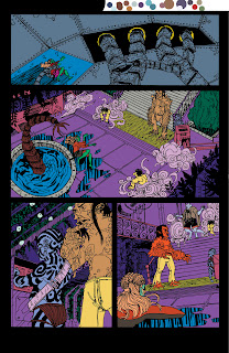
So, the first step in all of this is to separate shapes in the lineart in a process known as "flatting." At this time, I'm not worrying about the correct colors. I have two goals here:
1) Cover all the white of the page
2) Make sure all my colors are distinct enough from each other that I can select them with the magic wand later without any problems.
Whenever I do any color fill-ins, I always use the Pencil tool. Why? Because it's aliased, just like my lineart. Why in the heck would I work mostly aliased? Because it actually helps in keeping stuff fairly sharp when you scale down. If it was all done aliased, it can have the potential to become blurrier than you imagined.
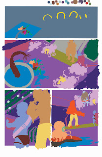 This is what the page looks like if I were to close the document and open it back up. Notice there's no white between the colors? This ties into a later step, called "trapping."
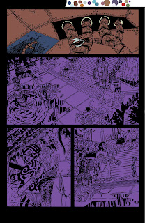 Now comes the time where I start to lay in the actual colors that will appear when the comic gets put on the web. I lock the layer that had my selection colors (all those ugly colors we saw earlier,) and start a new layer on top of it. Then, I usually use the rectangle selection tool and throw in large expanses of color to set the main colors of each scene. The top panel's color was blue, while as you can see, the bottom panels were a purple color for the Rhizome's airlock chamber. I'm still using the pencil tool.
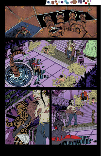 Here are all the base colors laid in with the pencil tool. You might notice on the top panel there's some fancy textures going on. Any sort of extra detailing that isn't just blocks of color, I'll do with a brush, since the brush will handle that sort of thing A LOT better than the pencil tool ever could. In some areas you can see I colored while thinking about shadows, but most of that work is saved for the next step.
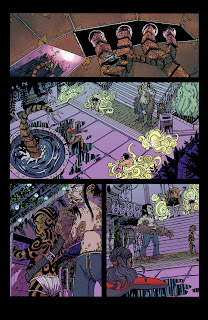 I create two new layers, one for shadows, and one for any sort of lighting effects (like the top panel.) The shadows are mostly handled with either the Multiply or Darken mode on, but the lighting effects can vary, depending on what's needed. The top panel's light effects were mostly done with the brush in Color Dodge mode, to get that super bright effect.
I should note, during all this, and especially towards the end, you should have color theory in mind. If your light is a cool green-blue, then you can expect your shadows to actually be something like a warm red-violet. There are a ton of places to learn about this sort of thing, and it's really a subject that goes beyond just this one post.
Anyway, back to the matter at hand: I have all my coloring done, and I flatten the image. Remember when I mentioned earlier about "trapping?" Well, I need to make sure my lineart has a deep-rich black, and there will definitely be NO WHITE between the lines. So, I copy my lineart (that was on a separate channel, remember?) back onto the main page with a color of 60C/40M/40Y/100K.
Why that mix? Because straight 100 percent black isn't really black, it looks more like a dark muddy grey. That mix above actually gives a deep, rich black.
Once the lineart is copied, I delete the extra channel, and save it. Now we take it into Illustrator, letter it, then save it as JPEG to the web! Then come Friday, you have a new page of Border Crossings!
Okay, now a few end-class notes: I really recommend picking up the DC Guide to Computer Coloring and Lettering. The other DC books are alright (I feel there's probably better material elsewhere,) but the Coloring guide is a BIBLE. All these steps I glossed over are covered in pretty good detail here, and it's definitely worth your money to have it with you if you do this regularly.
Now then, here are a few links that talk more about coloring and lettering:
Mark Sweeney's Blog: I actually found this about a half a week ago, but it answers a lot of questions like, "Why shouldn't I use black in my colors," or "Is RGB and CMYK really different?" Consider it supplemental reading to your DC guide.
Balloon Tales: This site goes into MUCH greater depth on lettering than I ever could. Worth a read to learn how to do lettering properly and why(something that most people who self-publish don't really take the time or care to learn.) Seriously, you want to look amateur? Don't read this site, and use Comic Sans or (god forbid) Arial for your lettering. You want your work to actually look professional, READ THIS SITE.

5 comments:
Dang dude! I can't keep up with you. I tell you I am going to comment on one and BAM another post. Log on this morning and BAM another post. I still have some discussion topics on each one of these I want to put forth over the weekend. I guess I am going to have to become a night owl blog commenter to get ahead of you. haha.
Great stuff!
Haha, no worries, Chuck. You can go ahead and comment on the previous posts too and I'll respond to them.
Hey man. I was wondering something about lettering and coloring. I assume that you do all the flats, trapping, and color at the 11x17 size in PS after you have scanned the page in. Once done with the colors however, do you reduce the page down to print size to do the lettering? Or do you do the lettering at 11x17 and reduce it down with the entire finished page?
No, I letter at the 11 x 17 size. Something to keep in mind is when you letter, you absolutely MUST make sure the letters are done aliased. Anti-aliased letters are fuzzy, hard to read, and never reduce or reproduce well.
You are the man!
Post a Comment