Friday, July 17, 2009

Digital Perspective Tutorial!

The next process post will be up tomorrow (could very easily have been up a few days ago, but life gets in the way...)

Chuck asked me about how I go about doing my perspective work digitally, I thought I'd take some screenshots of Photoshop to explain exactly what I do, since just words will probably make it far more confusing. I'm also thinking of doing a future post that shows some analog perspective tricks, for the folk that sit more at the drawing table than the computer desk.


Anyway, let the screenshots flow forth!
You'll probably need to click on them to view some details in a larger screen.
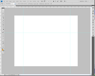


In your new document in Photoshop, enable Rulers (by going to View, show> Rulers.) From there, drag out some guides, you'll need at least three if you're doing two-point perspective (one to represent your horizon line, one to set as an anchor for your right vanishing point, one to set as your left.)
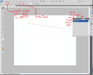

Once you have your guides laid out, click on View, and then select "Snap." Make sure the option for Snap to Guide is on, as this is how you'll make sure all your lines converge on the same point. For the sake of simplicity, I'd also make sure snap to grid is off.

Select the shape tool (I think it might also be called the polygon tool as well...) and change it to Line. Now, here's an important step, which I've highlighted in the screenshot: Make sure the option is set to Paths, and not shape. This prevents it from actually showing up on the canvas until you're actually ready (I should note that this version is CS4, so earlier versions might have this placed elsewhere. Refer to your help manual to see how your layout is set up, though if you're on CS3 it's probably the same.) Also note where you see the line show up: It's under a tab called Paths, which is usually grouped with the Layers and Channels tabs. Most likely, your line right now labeled as "Work Path."
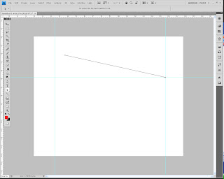

When I laid down the line earlier, I thought I had Snap turned on, but it turned out I didn't. So in this step, I selected the end point (I'll explain later how to do this) and dragged it to the right anchor point. It should snap into place where the two guide lines meet. Congrats! Your first perspective line is made.
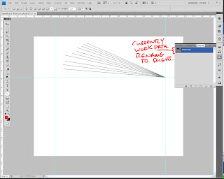

At this point, repeat the previous two (one if you had snap on and made it go to the anchor point first time through) steps to make as many more perspective lines as you want for the right vansishing point. Don't worry about making correct perspective, what we're doing is making a quick template that you can alter and change later. What you want right now is a bunch of lines that converge on the right anchor point. I'd try and make sure the other ends don't snap to any other guide points.

Once you've got a healthy amount (you can always add more later), double-click the name "work path", as if you were renaming a Layer. Incidentally, the name window pops up! This is how you save your path. If you left it as Work Path, next time you boot up PS, it'll disappear. Poof. Gone. Plus, we can't have the left and right VPs in one path selection (we could, but it gets messy.) So rename this one "Right VP" or "Right" or whatever else that will remind you that it's the right vanishing point.
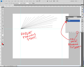
Now that you've gone and finished up the right vanishing point, it's time to do the left one. See the little button on the bottom, same place as where the button for "new Layer" is one the Layers tab? Click it, it creates a new path. Rename the path to be "Left V.P" or "Left." From there, repeat the steps you did to create the perspective lines for the Right V.P., but this time anchor them to the left point.
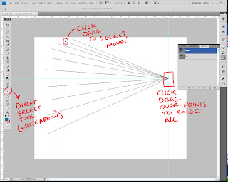
Okay, you've got both your V.P.'s lined and you're ready to make perspective. Using the Direct Selection tool (refer to the screenshot,) select end points to drag them around. I should note that even if you're selecting one line, you should do a Click-Drag method, since simply clicking on a point and moving it can create...problems. So just trust me on this. Pull out the lines to where you want them to be. This is also when you set up your V.P. in its correct position. Just click-drag to select all the end points on the V.P., then start dragging it around (you can take the time now to also adjust the guide if the Horizon line is too high up for you, or too low, etc.)

For the sake of this demo, I'm being really arbitrary about it, but of course in your own piece this is where you actually use all that knowledge you have of perspective to have CORRECT placement. I should also point out you can pull these lines well off the live area of the document, and they still show up, so you can gauge how far away you really need that V.P. Go ahead, try it, I'll wait.
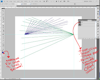
Finished? Good, because we're going to actually draw the perspective lines now. You see, the joy of Paths is that you can alter and change it before you actually decide to commit it to the page. Once you're ready though, here's what you do:

-Select for your foreground color the color you want to use for your perspective lines. I like to have each V.P. have a different color, but whatever doesn't confuse you, go for it.

-Select your pencil tool, and notch the size down to anywhere between 2-4 (you'll probably have to play with this, more in a bit.)

-create a new layer for your perspective

-Select the V.P. path you want to commit to the document.

-Right-click it, then select "stroke Path." Set it to Pencil, with "simulate pressure" OFF.

Voila! Your lines are now drawn on the page for one of your V.P.'s! Repeat these steps for the remaining ones, and your perspective grid is good to go for your drawing.

Regarding the Pencil Tool: you might have to do a few Ctrl+z's before you actually find the right size that works for the piece you're working on. Paths have a tendency to stroke a bit larger than what the tool actually does. So that brush size 4 may actually look like a 6 or an 8, just to give you an idea. Play around with it a bit.

I should also tell you that this works best for pieces that don't involve a Dutch Angle (titled view.) Anything that alters the horizon line from being a straight horizontal obviously can't use guides as the horizon line, but it is possible to still use this method (just some creative thinking will have to take place.)

Hope this helps out some folks, and of course, if you have any questions, feel free to ask away.

Tuesday, July 14, 2009

Layouts.

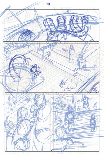
Above is the layout pencils for page 9 of Border Crossings. I thought I'd make this into a whole start-to-finish series of posts, so hopefully somebody gleans something from all this.

My process back in college was pretty varied, and fluctuated as often as the tide does. Early on, I used to do thumbnails, followed by roughs (on 6 X 9), followed by blown up roughs that I would tighten (11 X 17 at this point!), followed by lightboxing the whole page to clean it up.

I hated it, to say the least.

It took too long, and involved too much running around (popping out to Kinko's to make copies is never a good step to have...it just seems to slow down everything.) Once I got to drawing the actual page, I hated the page, and felt like I had drawn the damn thing several times over (which I did, more or less.)

So I switched it up in my Junior year. Two big things changed in my process that I kept with for a while: I penciled entirely in blueline (used to do tight blueline, then clean it up even further with a dark graphite pencil,) and I dropped doing the 6 X 9 roughs.

I was happy with it, it gave my work some much needed life in it, and kept the whole process fun for me, which was important.

There was a drawback though, which was the fact that lacking those roughs meant that I jumped straight from 2 inch high thumbnails to 11 X 17 comic board. Yikes.

Needless to say, I often erased and redrew stuff a lot. And I had some occasional problems with perspective.

Anyway, moving on. When I first started penciling Border Crossings, I kept it entirely digital, which was great! It brought back the rough pass on my pencils, which meant I could refine stuff without getting too detailed on everything. I blew up my thumbnails in photoshop, then started to refine right on top of them. My compositions were in place, I had rough perspective lines in (so I could lay down perspective that was right according to my original camera angle,) and all that other good stuff.

Unfortunately, after doing a few pages entirely digitally, it was tough. The pen felt really slippery against the tablet surface, so I didn't feel like I had too much control, which meant there were times of "Eh, it looks alright. It's not great, but it might work."

So, here we are. To be honest, this is the first time I'm doing this new step, but it worked out fine, and I think it's a good blend of all the pros of the old techniques:

I took the thumbnail of page 9 and scaled it up to 11 x 17 (remember how the thumbnails were already accurately proportioned? This is why.) From there, I ruled out the panel borders, and loosely defined the staging a bit better. If you notice in the second panel (it might be really hard to see, I think the opacity was turned down a bit too low,) there's some perspective lines gridded in there. These were done using the paths tab and the line tool to make sets of perspective lines for the left, right, and top/bottom VP. This allows me to accurately get perspective lines in there quick and painless, and to start to lay in some basic environment ideas. I actually have a digital template saved that has all these lines ready to be used, so I don't have to spend time recreating them for each page. I just select the right workpath, and set it in place.

You might notice the bottom right panel is different from the thumbs. This is another great part about the layout stage, I can change around some stuff and still keep it loose, and see if it'll work. In this case, the original idea in the thumbnail didn't seem to stage the reveal too well, so I altered it to bring us down near Venetia's viewpoint.

I should note this whole stage is done digitally. The point of it isn't to refine, but define some areas that were a little iffy in the thumbnails, and get things locked down that I know will be vital, like perspective lines.

From here, I flatten the whole image, and to make it easier to pencil over, switch it to grayscale mode, then to duotone mode. In Duotone mode, I set it to monochromatic, then give it 25% cyan only. This gives it a really light blue color that I can still see, but when I pencil, won't show up much in the finished pencils.

From there, I sit down at the drawing table and get started on actually drawing...

Sunday, July 5, 2009

Thumbnails.


Above, are thumbnails for upcoming pages for Border Crossings, which you can find right here. If you can make out my little scratchings, some of the pages up there (most notably 9, 10, and 13) have an alternate or two, in the event I didn't think a panel was working as well as it could have been.

This is actually a pretty recent trend for me in thumbnailing for my comic pages. Before, I would often scribble directly on the script, often right beside the panel description or near it. It was great because I could immediately map out what I had in mind, or I could try a few different variations and then notate which one I wanted to use later. Eventually, I'd reference them for them I start laying in my pencils, or I would scan them in, and stitch them together into a frankenstein Photoshop file, then pencil above that.

Unfortunately (at least for me, as all artists have different quirks to them,) it wasn't ideal. I often ran into the problem of having panels that didn't mesh together well enough, or were a lot more out of proportion with the comic page than I actually thought. What was once a great composition for the panel would have to be readjusted, or completely rethought if it turned out not to work as well.

So I made up a little thumbnail contact sheet in Illustrator, something even the simplest of graphic program users can do. From there, I still will occasionally scribble an idea directly on the script, but now I thumbnail directly into the little boxes (which, if you notice, are proportionate to a 10 x 15 live area of comic board, which is what I most frequently use.) Everything's in proportion, it's a small enough space to prevent too much noodling (though you might notice I couldn't help myself here and there,) and it lets you see a set of pages all at once to see if they work together or not (an incredibly important notion regarding any sort of sequential pages.)

Monday, June 29, 2009

Alien doodle


A quick little pattern/color study on an alien doodle...Photoshop.

Saturday, June 27, 2009

Back from Heroes Con! ...Just a week late.

So this post is going to be ridiculously stupid, because A) I can't show any of the artwork I worked on this past week or week before (and I didn't get much sketch time in that yielded any good nugglets) and B) Because it's a week later than I meant to post.

So we have some writing time instead! I got back from Heroes last Sunday, and all in all I can safely say that it's one of the best conventions I've gone to yet (and it brings my tally up to...3.) I loved how big "Artist's Alley" was (which it's almost a misnomer, since it takes up half the dang floor,) and I got to meet a lot of great people from the Sidebar Forums (anyone from there following this, I'm registered, but I can't post yet...) as well as from the Drawingboard.org, which was a great treat. I also got to meet one of my industry heroes, the always-talented Guy Davis, who was cool enough to give me a portfolio crit. The dude is seriously THE nicest guy I've met. Great talent and great personality.

In other news, Heroes also marked the launching of the comic I've been actively working on for a couple of months now! Border Crossings, which is written by my good friend Christian Sager, is a dark fantasy steampunk story that takes place in an alternate world with all sorts of monstrosities, water, and zombies. Think 20,000 leagues under the sea, mixed with H.P Lovecraft, creatures from movies like Dark Crystal, and you're more or less on track.

For all interested, you can check it out at www.thelastisland.com. Right now, we have 5 pages from the first issue and all 8 pages of the promo comic up, and we'll be updating it at a page a week. So check it out, leave a comment, and enjoy!

And I swear - I WILL have some new artwork up very soon.

Sunday, June 14, 2009

Photoshop Sketch


Trying out some new techniques when I should be in bed sleeping...approximately 1 hour.

Thursday, June 11, 2009

Donovan's Basilisk


This is a painting I did for ConceptArt's Creature of the Week (CoW.) I think it's about 2-3 hours put into it? Maybe less, maybe more, I dunno. It's not perfect on the painting side of things, but I like the idea of it quite a bit. Here's the description I put in for it on CA:

Supposedly discovered by a druid in medieval England, Donovan's Basilisk is a large, cave-dwelling reptavian. Unlike other breeds of Basilisks documented, it doesn't possess the ability to paralyze by venom or stare, and is considered one of the more 'docile' varieties of Basilisk to be found, if such a thing can be believed. It possesses an oily, slick coat of quill-feathers, which seems to aid in retaining the creature's unnaturally high body temperature. Large bioluminescient skin tags line the creature's back, and seem to vent much of the heat off of the creature, while a smoky discharge continuously emanates from the creature's nostrils. This combination of sweltering heat and stifling air gives it a huge handicap when it hunts, often suffocating its prey simply by laying in wait while it pours out this noxious concoction.

Friday, June 5, 2009

Rien Poortuliet Study


Here's a paint study I did from Rien Poortuliet and Wil Huygen's book Gnomes. Great book with some fantastic illustrations done in watercolor/gouache from what it looks like. I did the study in Painter, and since Painter's watercolor features aren't as great as some of their other media (Artist's Oils come to mind...) It's not recreated using similar media materials as Rien. This was a pretty fun exercise, as it teaches some mindful color picking, and using brush strokes to their full effectiveness. Maybe I'll try somebody like Leyendecker or Sargent next...or if I'm stupid/brave, a Bierstadt! Obviously, original image and IP is copyright Rien Poortuliet, Wil Huygen, and Abrams Publishing.

Wednesday, June 3, 2009

Creature Doodle


Hey All,

Here's a quick little doodle I did during lunch yesterday. I named the critter "Ploorg."

Thursday, May 28, 2009

Alien Dino Redux


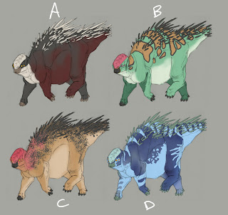
I decided to apply what I learned from the Candy Demon to my previous painting attempts, so I figured I'd restart that alien dino drawing from before. I didn't particularly care for where it was going, and I didn't have much of a clear idea of what the colors on it were going to be. This time around I came prepared!

I made a mockup of 8 color/pattern variations that I thought were the best out of the ones I brainstormed, and just have to pick out of those now...right now, I think E or F might be the best to go with, but maybe someone out there has a different opinion.

Wednesday, May 27, 2009

Candy Demon Progression


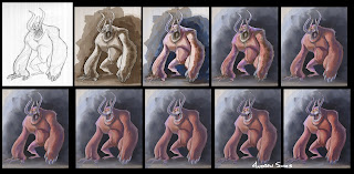
My friend Errol asked me how I went about the last painting, and after flubbing it trying to explain it entirely in words over the phone, I thought I'd put together this.

The process I took is a weird combination of Ryan Church and traditional oil painting, apparently. So I'll try my best to explain it clearly:

The brushes I used for it weren't any special, custom brushes (except for a minor one!) With the lineart opened in Painter, a new layer was created, set to 'gel'. From there, I started to lay in monochromatic washes with the broad water brush (found in digital watercolor), making sure that whenever it couldn't get any darker, I'd dry the layer, drop it, then make a new one to keep going until I got the right range of values I was looking for. This process was repeated probably 3, maybe 4 times in total.

Once that was done, a new layer was made, set to colorize. Here, I took the scratchboard tool (found in pens), and set the opacity to something like 15-20%. This when you can experiment with different color schemes and see what work in terms of temperatures and hues. Since this was the first one I tried this way, I used really saturated colors to make sure the colors came through, since the colorize layer is treated like a glaze almost.

After this, I only used four tools from here on out: an Eraser (I sometimes used a scratchboard variant that I turned into an eraser, but it's usually too hard of an edge at this point,) scratchboard tool (this time with opacity at 90-100%,) Artist's Oils Drybrush, and Artist's Oils Blending Brush. The Drybrush was the most used tool, and most of the gruntwork was done with that. The scratchboard tool was only used for small details, like making the teeth, refining some edges, and doing the swirls on the tusks and claws. The Blending brush didn't come in until way towards the end, when I need to smooth out value transitions in some areas and clean up the roughness of it all. At some point early on, I used the water rake (found in blenders) to smooth stuff out and also start to get the feel of fur going on, but it was the only time I had used it, and I probably could have skipped it altogether if I just kept blending and refining with the tools above.

Once it was finished up and posted on here, I thought it might have looked a little too even in values, so I took it into Photoshop and punched up the values using Curves.

Well, I think that answers all of that! Hope it wasn't too confusing, Errol!

Monday, May 25, 2009

Candy Demon!


So I took the demon to completion in Painter! Happy with how it came out, though I think I might add some markings to him or something...

Monday, May 18, 2009

Monday block-ins...


A relatively quick update as I take a break from coloring comic pages...

Here's the color block-ins of the previous two sketches. They're both done in Painter, and pretty much approached from different directions: The Ol' Troll is getting a smack of Artist oil's on him, while the alien dino is getting transparent glazes of the scratchboard tool (I think this is the way Ryan Church builds up his paintings...hadn't figured out where he goes from here though...). It's been tortuously slow as I try and mesh my need to learn how to paint with my stubbornness (Or is it fear?) or losing my lines...but I'll get there. I'll get there.

Wednesday, May 13, 2009

Break Sketches


Sorry for the radio silence, folks. I've been working nonstop on the promo Chris and I are getting together for Heroes Con, and since we need to send it out to the printer really soon to allow breathing room for the covnention. So to keep the blog at least semi-alive until I'm done later this week, here's some sketches I did yesterday during my day break between inking and coloring. One's a troll, and the other is a...well...uh...an alien dino?

Thursday, April 30, 2009

Gestures


S'more gestures done this morning for warm-up...

Monday, April 27, 2009

Brush Tomfoolery


Quick update since there's a bit of work I need to jump on today...

Here's a little morning warmup I did to loosen up my arm. I was testing out a new brush I made from a standard round, as well as some new keys I mapped to wacom pen (I feel kinda dumb for not realizing I can map keystrokes to the pen's buttons!) So now instead of having to reach waaay across the keyboard to adjust the size, I just click the little buttons instead. I lose my right-click, but only for PS.

Anyway, yeah, not the greatest of paintings, but hey, at least I tested out some new stuff!

Wednesday, April 22, 2009

Back to the drawing board...


Well, after two weeks of being more or less out of town (a few days spent in town inbetween trips,) I'm back and the gears are cranking again! Some quick news, followed by sketches done this morning and on the plane trips...

If you've been following this blog for a bit, you know I've been working on a comic called Border Crossings. Well, we currently have a website up and running, which you can find over at www.thelastisland.com. Currently, we have the pitch up there, but as we get closer to June, the site will be transformed to support the webcomic, and we'll be updating it with new pages from the first issue.

Why June? Because we'll be at Heroes con and we want everything to be up in time so we can show off the goods and point as many people as we can to our product, that's why! We'll be having a table there, and as time goes on, I'll give out the details for that.

So for now, here's some sketches. One of them had my precious speedball pen vomit all over it, so just don't mind that. I think it was going through the same pressure stuff I had on the plane, cause my eyes felt like they were going to pop outta the head from sinus congestion...fun times, this allergy season.

Monday, April 13, 2009

Sketches


Some stuff from the sketchbook while I was out of town...on a related note, I'll be out of town again this week! I'll be sick of planes by the end of it all.

Friday, April 3, 2009

Aquarium and Critter

Well, it's my 60th post, so here's a mix of observed and imagined drawings. I went to the Atlanta Aquarium last weekend on a particularly rainy day, and got a slew of photographs, and when the crowds weren't thick, a few drawings in here and there. Here's a couple of them.


I also did up this little drawing of a critter the other day, then decided to bring him into photoshop to try and do some more painting study. I think it might be another step in the right direction, but still a long ways off to what I eventually want to be able to do.

Monday, March 30, 2009

S'more gestures!


Some more from today's warm-up. Same as before!

Sunday, March 29, 2009

Gestures


Some gestures done today, 30-sec each, courtesy of posemaniacs.com

Thursday, March 26, 2009

Morning doodle


Here's a little watercolor sketch I did in Painter X. The lines were made with the scratchboard pen tool, and it's quite possibly my favorite tool in the world.

...Of course, it also proves how terrible I am at actual painting, but I'm trying, honest! I just see things very linearly instead of color and light.

Tuesday, March 24, 2009

Environment Building

What do you do if you have a specific set of scenery that's going to show up frequently in your pages?

That's something I ran into this past weekend as I was prepping thumbnails for more pages of Border Crossings. Throughout the (eventual) 5-issue arc, the main characters travel on a Nautilus-like submarine called The Rhizome. Before I could start penciling any pages involving the interior of the Rhizome, I had to lay out a floorplan.

If you're faced with a scene you know you're going to visit frequently, or if it's a very specific place, you need to make sure you have the floorplan of the set planned accordingly. Otherwise, you'll run into the misfortune of drawing randomly placed things in the background, which throws off the disbelief of the artwork, and eventually you'll be called out for your laziness or ineptness (Not really, but considering how some readers are, you never know.)

This isn't a new idea by a long shot. Illustrator Frank Hampson used to construct scale exterior and interior models of the spaceships seen in his strip Dan Dare, ensuring that everything was properly in its place. It also provided him with a means to see how the ship would be affected by lighting schemes, so it provided a double-use.

Modern-day comic book artists like Paolo Rivera and Lenil Yu use similar techniques, using a program called Google Sketchup. It's all the frustration of making a scale model, without the cost of materials or storage! And it makes it incredibly easy to set up your shot, save it as a jpeg, then use it for reference or lightbox drawing, depending on your workflow.

TV and movies have been doing stuff like this for YEARS. Look at the floorplans for the Millennium Falcon, or the Serenity from Firefly. These were all designed so you wouldn't have reality inconsistencies. Looking at the blueprint above of the Serenity, how weird would it be if the characters left the cargo room and immediately showed up in the bridge?

I haven't reached this stage yet with the Rhizome, but here's what I have so far. The exterior needed to be tweaked a bit in its design from its days in the promo comic (which means when it comes time to ink that splash page, I'll need to ensure that I adjust the drawing,) but you can see what I have planned out for the interior. For me, this isn't enough. I still need to make more detailed floorplans of key areas (Engine room, Bridge, Holding Bay, etc), and I also need to design the interior aesthetics. But once all that hard work is out of the way, I'll have a very concrete set I can stage all my action on, which helps the believability of the story.

Tuesday, March 17, 2009

Digital Pencilling

So, I recently started up work on Border Crossings. This was originally a comic that was pitched to Red5, but they decided (after a few drawn out weeks,) to not carry it. I suspect it was partly because at the time we pitched it, Diamond dropped their new (and stupid) shipping policy, and they decided to not bring on another new title. It's unfortunate, but to make up for it me and the writer Christian have started it up as a webcomic. Currently, the site only has the promo, but as time progresses (and before Heroes Con) we'll have a full site up and running with new content. You can view the current url with the promo here.

I bring this up because I'm taking a different approach to these pages than I have to comic work in the past. To help speed up stuff, I'm digitally penciling the pages first, then printing them out to ink them traditionally. So far, I've been having a blast, even though the surface of the cintiq screen is a little slippery for my tastes. That's why I hadn't bothered doing it entirely digitally, simply because I don't have nearly the same amount of control.

So here's the digital pencils from panel 1 of the first page...

And here's the inked version!

So far, I can't complain.

Thursday, March 12, 2009

Painting Madness

Whoo...bit of a while since my last post. It's not that I haven't been busy, just haven't had anything worthwhile to throw up.

So here's a WIP I have of a little painting I'm doing in Painter X. I've tried out Painter in the past, but never really took for it, and this time I decided to really sit down and do a piece from start to finish.


Here's a bit of the underpainting for you all to check out, sans the refining bits on top. I feel like this thing is nowhere near the end of it, but it's done at least for the day. Approaching something like this is difficult, for me at least, since for some reason I just can't wrap my head around color forms. When I see line, I feel confident in it, but the more that disappears, the more unsure I get... I guess what I really should be doing is finding my own style of painting. In the meantime, I'll keep flailing as I try to get a footing.

Thursday, February 26, 2009

Random Fun


Best fun is always with abstract perspective boxes...'cause who knows where it'll lead.

Some more BC sketches


Hey all, So, come next week I'll be hitting the pages to start penciling Border Crossings. This week I've been spending drawing and tweaking designs and getting the feel for the world itself. I still have to do some environment studies as well as thumbnails for the pages, but no worries. Anyway, here's some stuff from that, of the local fare that inhabit the Last Island of the world. The weird gnarly fella that's been colored? He's a glass being of sorts, so I'll probably need to find myself some nice lighted references of glass sculptures by Chihuly or something.